
The landscape of digital payments and asset management is undergoing a significant transition as Google prepares to roll out a major aesthetic and functional redesign of its Wallet application. For years, Google Wallet has served as a digital repository for everything from credit cards and boarding passes to loyalty programs and gym memberships. However, as the number of digitizable items grows, the challenge of maintaining an organized, accessible interface has become increasingly complex. The latest discoveries within the Google Wallet v26.5.862583415 release suggest that the tech giant is moving toward a curated experience, prioritizing frequently used items while inadvertently adding layers of friction for those seeking to access their broader library of passes.
The core philosophy behind this upcoming redesign appears to be centered on the concept of "starring" or favoriting specific passes. In the current iteration of Google Wallet, users are often met with a vertical or horizontal list of cards that can become cumbersome to navigate once the number of stored items exceeds a handful. To combat this "clutter," Google is introducing a home screen that emphasizes a selection of user-defined favorites. This shift marks a departure from the traditional "list-all" approach, moving instead toward a dashboard that requires active management from the user to remain efficient. While this promises a cleaner look for the average user who relies on two or three primary cards, it introduces a new workflow for power users who manage dozens of digital assets.
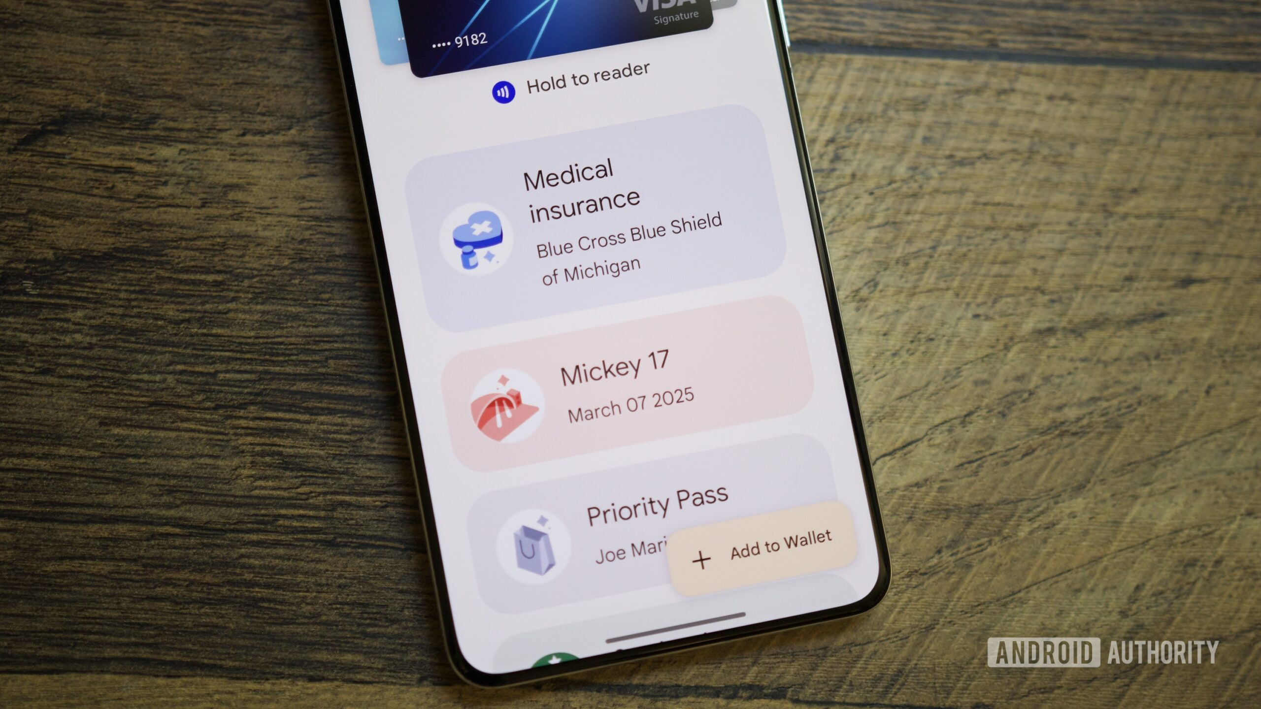
Recent investigations into the application’s underlying code, often referred to as an APK teardown, have revealed the granular details of how this new navigation flow will function. The most notable change involves the "View more" button located on the primary home screen. Initially, it was assumed that this button would serve as a direct shortcut to the full list of a user’s passes. However, the latest version of the app clarifies that this is not the case. Instead, tapping "View more" leads the user to an intermediate landing screen. This secondary layer serves as a management hub, housing a search bar, general settings, and a dedicated section for managing payment methods. Only after navigating this middle ground can a user tap a second button, labeled "View more passes," to finally see their entire collection.
This two-step process represents a significant shift in user experience (UX) design. In the world of mobile interface optimization, "clicks" or "taps" are a currency of efficiency; adding an extra tap to reach a core feature is usually a move made with careful deliberation. By placing a buffer between the home screen and the full list of passes, Google is effectively signaling that the home screen should be the definitive destination for 90% of user interactions. The intermediate screen acts as a filter, encouraging users to use the search function or to better curate their "starred" items rather than scrolling through an exhaustive list.
To assist with this curation, Google is introducing a "Manage passes on home" interface. This dedicated section allows users to toggle which passes appear on the main screen and, crucially, provides the ability to reorder them. This level of customization has been a long-standing request from the Android community, as the automatic sorting algorithms used in previous versions often buried relevant passes at inopportune times. The star icon will become the primary tool for this organization, acting as a gatekeeper for what earns a spot on the precious real estate of the app’s launch screen.
Beyond the favoriting system, the redesign brings long-overdue improvements to how the "all passes" list is organized. Once a user navigates through the two-step process to reach their full library, they will find new sorting capabilities. Users will be able to arrange their passes alphabetically or by "recently opened." This latter option is particularly useful for travelers or shoppers who may need quick access to a specific pass for a duration of time—such as a multi-leg flight itinerary or a seasonal discount card—without necessarily wanting to "star" it permanently. Furthermore, the app is refining its treatment of archived passes. These expired or unused items will be relegated to a specific section at the very bottom of the list, ensuring they do not interfere with active digital assets.
The move toward a search-centric and favorite-centric UI mirrors broader trends in the mobile ecosystem. As digital wallets evolve into "everything apps"—storing digital IDs, car keys, health insurance cards, and office badges—the sheer volume of data makes a simple list view obsolete. Apple Wallet and Samsung Wallet have faced similar organizational hurdles, with each platform experimenting with folders, stacking, and AI-driven suggestions. Google’s approach seems to lean heavily on user agency, betting that users will prefer to manually star their important items rather than relying on the app to guess what is relevant in the moment.
However, the introduction of the intermediate "management" screen suggests that Google may have even broader ambitions for the Wallet app. By creating a dedicated space for "Settings" and "Manage payment methods" outside of the main feed, Google is setting the stage for Wallet to become a more robust financial and identity management tool. This space could eventually house more complex features, such as transaction histories, detailed security settings, or integration with other Google services like Pay and personal identity verification. The search bar on this intermediate screen is also a critical addition; for users with a high volume of passes, typing a few letters is often faster than navigating any number of menus, and its prominent placement suggests Google wants to train users to think of Wallet as a searchable database.
It is important to note that these features were discovered through a technical analysis of the application’s package, meaning they are currently in a "work-in-progress" state. Google frequently tests features in the backend of their apps that may be altered or entirely scrapped before they reach the general public. The specific version analyzed, v26.5.862583415, provides a snapshot of Google’s current trajectory, but the final implementation could see the "two-step" process streamlined if internal testing suggests it is too cumbersome for the average user.
For the end-user, the takeaway is a mix of improved organization and a slight increase in navigational complexity. The ability to manually sort and pin passes is a major victory for those who have found Google Wallet’s previous automated sorting to be hit-or-miss. On the other hand, the transition from a single-screen experience to a multi-layered one may frustrate users who liked the "flat" design of the previous versions. As Google continues to refine the interface, the focus remains clear: the digital wallet is no longer just a place for your credit cards; it is a personalized command center for your digital life, and like any command center, it requires a bit of setup to function at its best.
As the update moves closer to a public release, the Android community will be watching to see how Google balances these new organizational tools with the need for speed. In a retail environment or at a transit gate, every second counts, and the success of this redesign will ultimately be measured by how quickly a user can produce the specific pass they need. While the "starred" system optimizes for the 90%, the remaining 10% of interactions will now require a bit more intent and a few more taps. Whether this trade-off is welcomed by the masses remains to be seen, but it is a clear indication that the era of the simple, one-size-fits-all digital list is coming to an end.