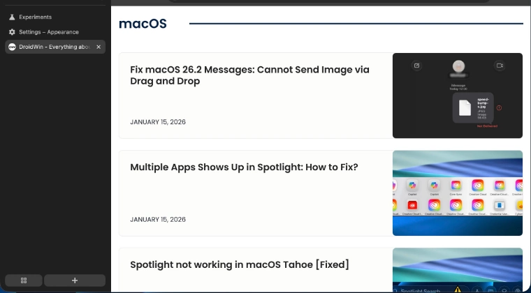
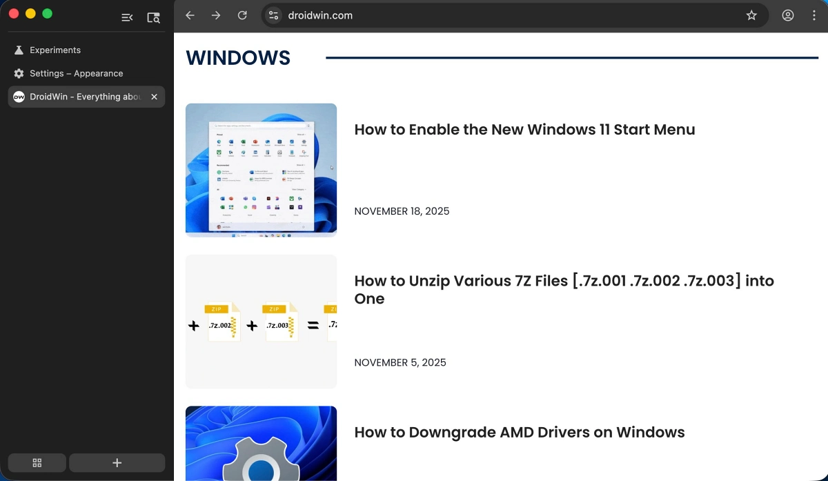
The landscape of modern web browsing is undergoing a fundamental structural transformation as Google, the Mountain View-based technology leader, begins testing a radical departure from its traditional user interface. For the better part of two decades, the horizontal tab bar has served as the industry standard, a design choice rooted in the early days of desktop computing when screen real estate was limited and aspect ratios were largely square. However, as display technology has evolved toward ultra-wide resolutions and vertical space has become more precious than horizontal breadth, Google is finally experimenting with a native vertical tab implementation. This shift represents more than a mere aesthetic adjustment; it is a significant reconfiguration of how users interact with the web, challenging years of entrenched motor patterns and psychological expectations regarding browser navigation.

For the veteran user, the transition to vertical navigation is often met with a mixture of curiosity and resistance. Since the inception of Google Chrome in 2008, the top-mounted tab bar has been the focal point of the browsing experience. Muscle memory dictates that a user’s cursor automatically drifts toward the upper margin of the screen to switch between active tasks or to initiate a new search. Relocating these essential controls to the left-hand flank of the browser window requires a cognitive recalibration that can, during the initial phases of adoption, feel counterintuitive. Yet, the logic behind this change is increasingly sound. On modern 16:9 or 21:9 monitors, horizontal space is often underutilized, while vertical space is frequently occupied by sprawling website content. By moving the tab list to the side, Google aims to maximize the viewable area for content while allowing users to manage a higher volume of open pages without the titles becoming illegible.
At this stage of development, the vertical tab feature is not yet available to the general public through the standard, stable release of the browser. Instead, it is currently sequestered within the Google Chrome Beta channel, a platform designed for enthusiasts and developers to test upcoming features before they are polished for global distribution. Even within the Beta environment, the feature is not enabled by default. It remains hidden behind the "Chrome Flags" menu—an experimental laboratory where Google stores features that are still undergoing rigorous internal evaluation. This double layer of insulation suggests that the feature is still in its nascent stages, and users should approach its activation with the understanding that the experience may lack the seamless stability associated with the final product.

To engage with this experimental layout, a specific series of technical steps must be followed. First, a user must ensure they are running the latest version of Chrome Beta. Once the browser is launched, the user must navigate to the internal experimental URL by typing "chrome://flags" into the address bar. This interface provides access to the underlying architecture of the browser, allowing for the toggling of various "flags" or feature switches. By searching for the term "Vertical Tabs" within this menu, users can locate the specific toggle required to activate the sidebar navigation. After setting the flag to "Enabled," the browser requires a full restart to apply the structural changes. Upon relaunching, the familiar horizontal bar is supplemented or replaced by a vertical column on the left side of the frame, instantly altering the visual weight of the application.
One of the most significant advantages of this implementation, particularly for those hesitant about such a drastic change, is its inherent reversibility. Unlike some of Google’s more forced UI updates, the vertical tab system is designed to be highly modular. Users can toggle the feature on and off with relative ease, or even revert to the traditional layout if the sidebar proves to be an impediment to their workflow. This flexibility is a crucial component of Google’s testing strategy, as it allows for the collection of user feedback without permanently alienating those who prefer the classic "top-down" approach to tab management.

However, the current iteration of vertical tabs is not without its functional hurdles. Early adopters have noted a specific point of friction involving the sidebar’s "collapsed" state. In its expanded form, the vertical tab bar provides clear titles and favicons for every open website, making it superior to the horizontal bar when managing dozens of tabs simultaneously. Yet, to save space, the sidebar can be collapsed into a narrow strip that only displays icons. In this minimized state, a significant usability flaw emerges: clicking on a tab icon frequently results in the tab being closed rather than selected. This behavior suggests a conflict in the hit-box detection or a lack of refined logic for switching between tabs when the menu is in its compact form. For many, this specific issue represents a deal-breaker, as the primary benefit of vertical tabs is the ability to maintain a streamlined workspace without sacrificing the speed of navigation.
The introduction of vertical tabs in Chrome is also a reactive move in the broader browser wars. Microsoft Edge, which shares the underlying Chromium engine with Google Chrome, has featured a robust and highly praised vertical tab implementation for several years. Edge’s version includes advanced features such as tab grouping, the ability to resize the sidebar dynamically, and a more intuitive "auto-hide" function. By bringing this feature to Chrome, Google is effectively acknowledging that Microsoft’s design philosophy has resonated with a significant portion of the professional user base. It is an attempt to achieve feature parity and prevent the migration of power users who require better organizational tools for intensive research and multitasking.

Furthermore, the shift to verticality addresses the "tab overflow" problem that has plagued horizontal designs for decades. In a traditional layout, as the number of open tabs increases, the width of each tab decreases until only the favicon is visible, eventually hiding even the icon. Vertical tabs solve this by utilizing a scrollable list, ensuring that the title of the website remains readable regardless of how many pages are open. This is particularly beneficial for researchers, developers, and students who often find themselves with fifty or more tabs open during a single session. The vertical orientation allows for a more natural, list-based reading experience that aligns with how humans process information on a page.
As Google continues to iterate on this feature, the tech community remains divided on whether it will ever become the default setting. The challenge lies in overcoming twenty years of psychological conditioning. For the average user, the browser is a window to the internet, and any change to its frame is viewed as an intrusion. Google must refine the "collapsed" state interactions and ensure that the transition between horizontal and vertical modes is as frictionless as possible. There is also the question of "Material You" integration—Google’s current design language—which emphasizes personalization and fluid animations. Integrating vertical tabs into this aesthetic framework will be essential for making the feature feel like a native part of the Chrome ecosystem rather than a bolted-on experiment.

In conclusion, the arrival of vertical tabs in Google Chrome Beta signals a pivotal moment in the evolution of the world’s most popular web browser. It is a recognition of the changing nature of digital workspaces and a response to the growing demand for more efficient screen utilization. While the current implementation remains hidden behind experimental flags and suffers from minor functional inconsistencies, its potential to improve productivity is undeniable. Whether this becomes the new standard or remains a niche tool for power users will depend on how Google addresses the feedback from its current testing phase. For those willing to brave the minor instabilities of a Beta build, the vertical tab system offers a glimpse into a future where the browser adapts to the hardware it inhabits, rather than forcing the user to adapt to the limitations of the past.

