

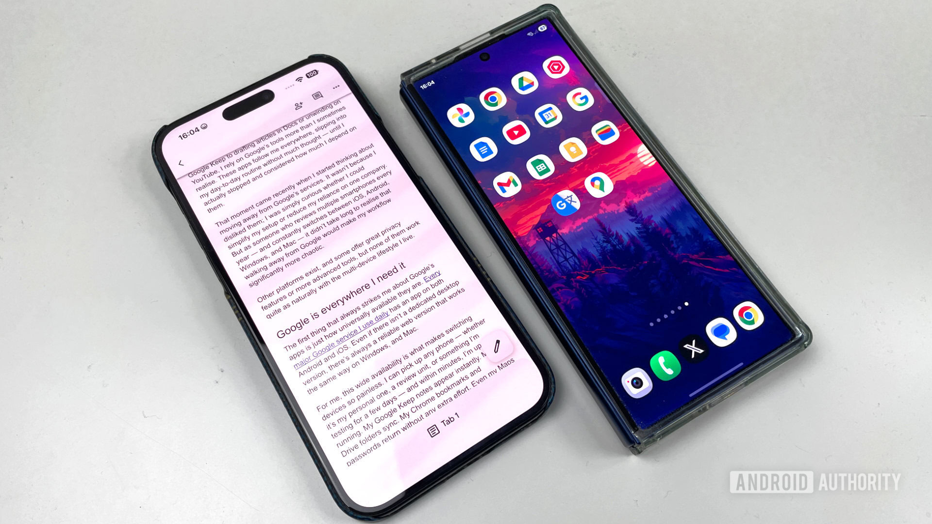
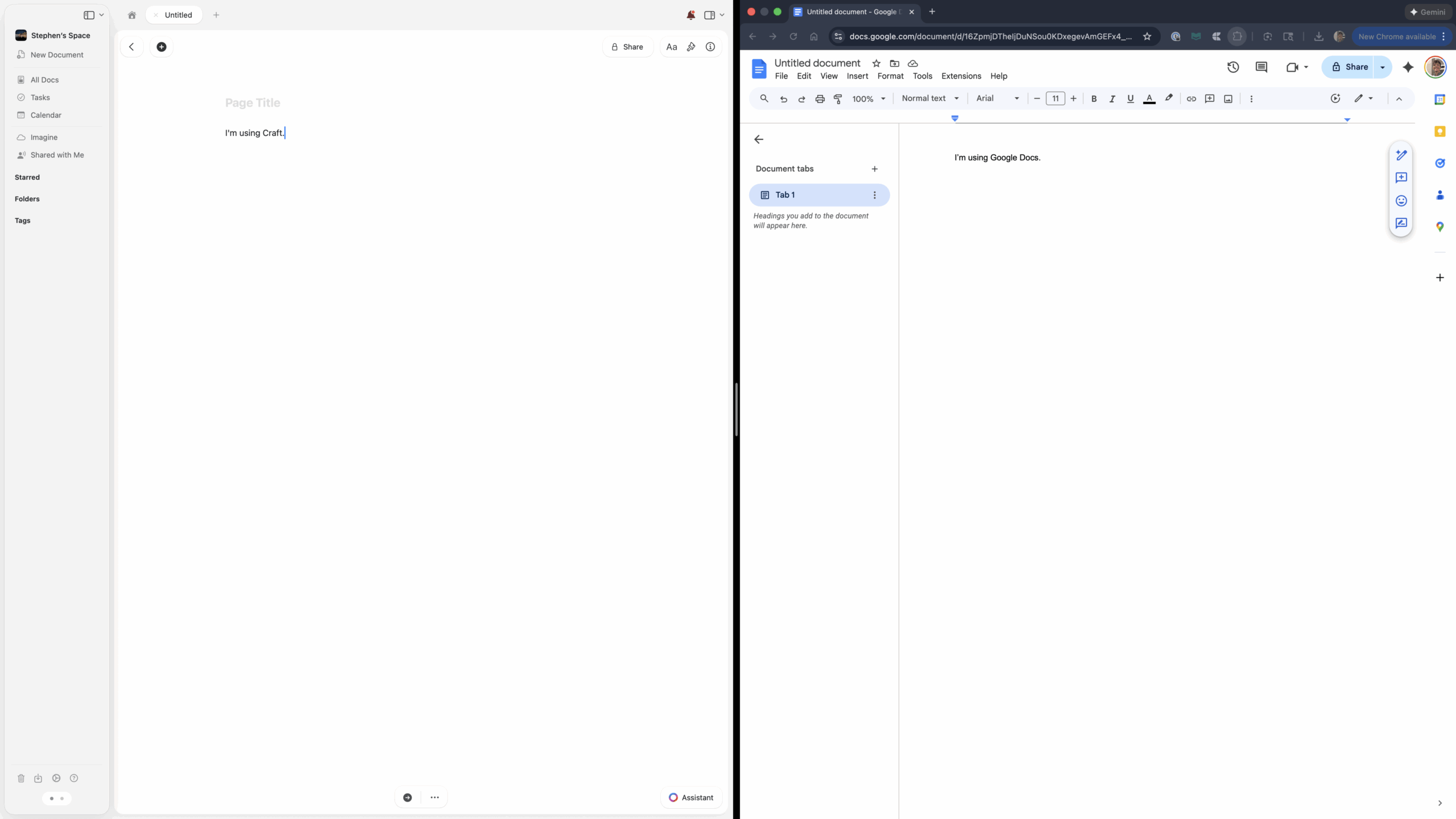
In the modern landscape of digital labor, the pursuit of the "holy grail" of productivity is a journey fraught with trial, error, and a constant cycle of software adoption and abandonment. For years, the market has been saturated with a "dime a dozen" array of applications, each promising to be the definitive solution for organizing the chaotic intersection of professional obligations and personal life. From the structured boards of Trello to the granular database logic of Notion and the rapid-fire list-making of Todoist or TickTick, many users find themselves in a perpetual state of migration, searching for a system that finally "clicks" with the idiosyncratic way the human brain processes information. Recently, a significant shift has been observed as users move away from the ubiquitous reliability of Google Docs toward more integrated, aesthetically driven platforms like Craft, which has finally bridged the platform gap by arriving on Android.
The transition away from Google’s ecosystem is not a decision made lightly. Google Workspace—comprising Calendar, Docs, Tasks, and Keep—represents the gold standard of accessibility and cross-platform synchronization. In recent years, Google has made concerted efforts to weave these disparate threads into a more cohesive tapestry. We see this in the way Google Tasks is now natively embedded within the Calendar interface or how Keep reminders are automatically funneled into a user’s master task list. However, despite these incremental improvements in interconnectivity, the underlying architecture of Google’s suite remains rooted in its origins as a collection of standalone tools. For the power user, this manifests as a persistent lack of a centralized "home base." Managing a complex project often requires a cognitive "context switch," as the user must jump between a text document for ideation, a calendar for scheduling, and a separate task manager for granular execution.
The fundamental flaw in the legacy document model, typified by Google Docs, is the lack of direct, two-way interaction between content and action. While Google has introduced features for work and school accounts that allow users to create tasks directly within a document, the implementation often feels clunky and unintuitive for the average user. There is a palpable disconnect when a task created in a document does not feel like a living part of the broader schedule. This fragmentation leads to a "bird’s eye view" problem: when information is scattered across three or four different applications, the user spends more time managing the tools than performing the actual work.
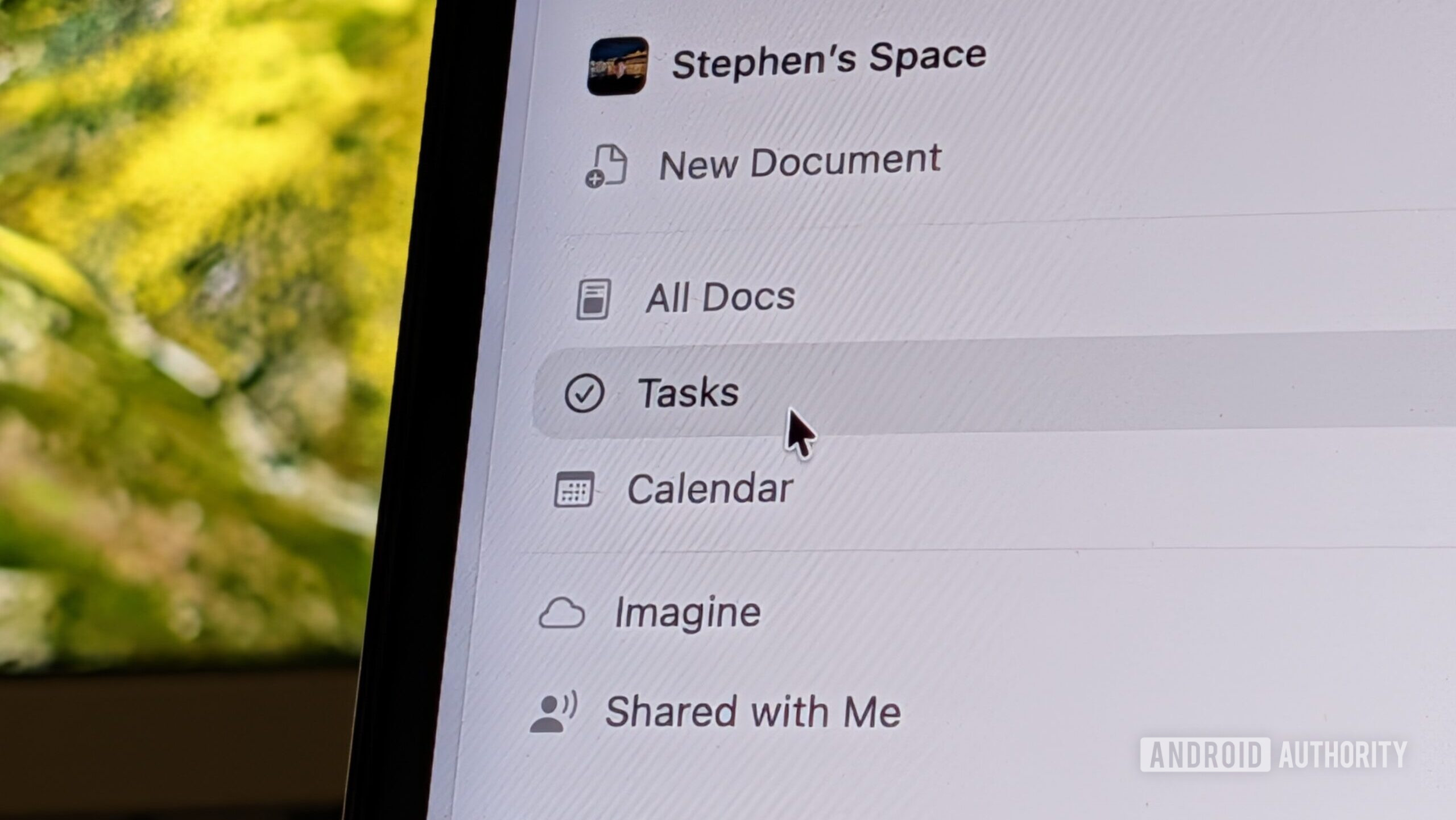
Enter Craft, a platform that positions itself not merely as a word processor, but as a malleable environment where documents and tasks exist in a symbiotic relationship. The primary differentiator is Craft’s "Tasks view," which serves as the elusive home base that legacy suites lack. Instead of forcing the user to hunt through dozens of folders to find what needs to be done, Craft aggregates every task from every document into a single, unified interface. These tasks are organized by due date and categorized by their parent document, allowing for a level of prioritization that feels natural rather than forced. This system honors the way projects actually function—tasks do not exist in a vacuum; they are tethered to specific contexts, and seeing them arranged by document helps maintain that vital mental link.
Beyond the functional architecture, there is the undeniable element of "software soul." Google Docs, for all its utility, has begun to feel increasingly stale. While it has received minor cosmetic updates to align with Google’s Material 3 design language, the core experience remains clinical and utilitarian—a digital version of a white sheet of paper. Craft, conversely, treats the document as a canvas for digital artistry. It operates on the philosophy that if an environment is beautiful, the user will be more inclined to spend time within it. This isn’t just about vanity; it’s about reducing the friction of "boring work" by making the interface a place of aesthetic pleasure.
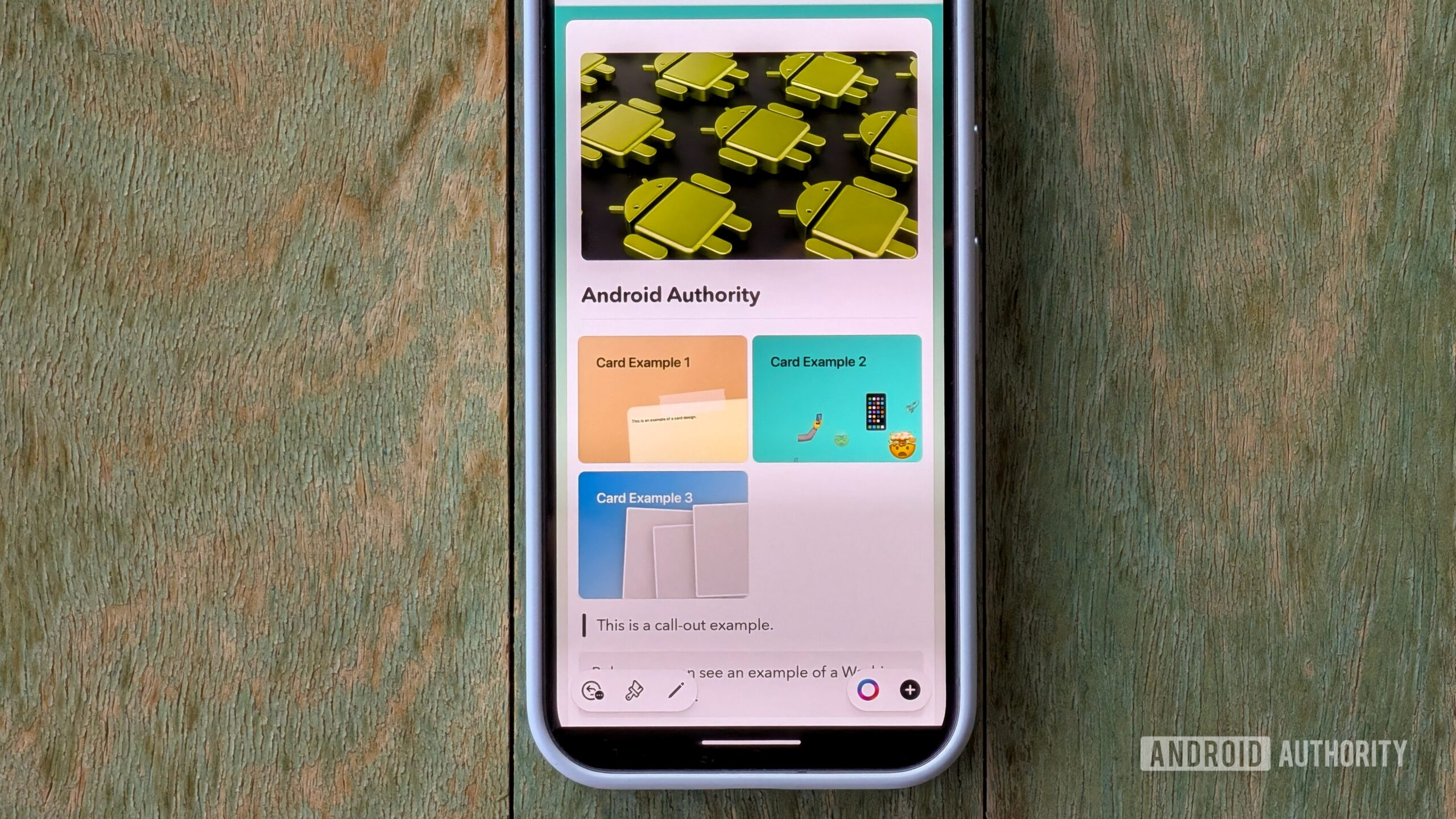
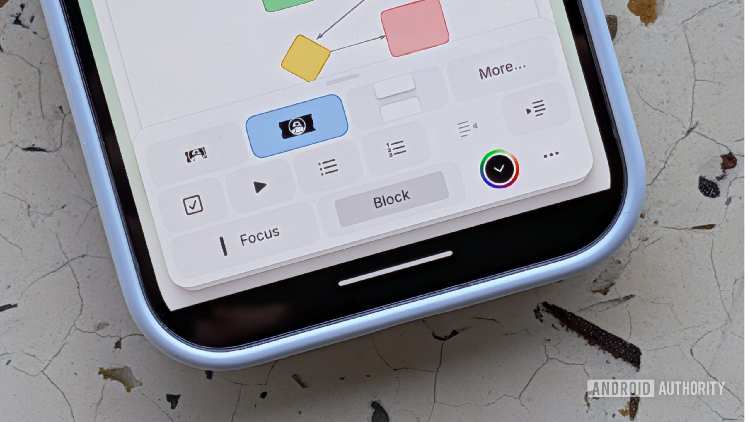
Craft’s design language is built around "rich blocks." While a standard document begins with black text on a white background, it can quickly evolve into a multi-dimensional workspace. Users can insert whiteboards for visual brainstorming, collection tables that mimic spreadsheet functionality without the complexity, and "smart links" that provide rich previews of external content. One of the more charmingly specific features is the ability to use "Washi Tape" designs as line separators, a small detail that exemplifies the app’s commitment to personal expression. By allowing documents to be linked via "cards"—which act as stylized gateways to related notes—the app transforms a flat file system into a web of interconnected ideas.
Perhaps the most surprising element of Craft’s success is its sophisticated sound design, an area often ignored by productivity developers. The app utilizes a palette of auditory cues to provide tactile feedback in a digital space. Marking a task as complete triggers the sound of a pencil on paper; creating a new document is accompanied by the soft ruffle of stationary; and entering "focus mode" provides a distinct auditory transition that signals to the brain it is time for deep work. These sounds are not mere gimmicks; they are the result of a deliberate design process intended to make the software feel more organic and responsive. This sensory feedback creates a "Pavlovian" loop that can actually enhance focus and provide a sense of satisfaction upon the completion of mundane tasks.
The community surrounding Craft also plays a pivotal role in its rapid evolution. Unlike the monolithic and often slow-moving development cycles of tech giants like Google, Craft’s leadership maintains an active presence on platforms like Reddit and Slack. This direct line of communication between the founders and the user base allows for a rapid iteration cycle. When users provide feedback on a specific feature or report a bug, the turnaround time for a "Whats New" release is often remarkably short. This agility creates a sense of partnership between the developer and the user, fostering a level of brand loyalty that is rare in the productivity space.
However, the transition to Android has not been without its growing pains. For a long time, Craft was an "Apple-only" secret, optimized for the fluidity of iOS and macOS. The recent release on the Google Play Store is a significant milestone, yet it remains in a beta state. Current Android users may notice that the app lacks some of the buttery-smooth animations found on its Apple counterparts, as the current version appears to be a highly polished adaptation of the mobile web app. While the feature parity is impressive for an initial launch, the "native" feel that Apple users enjoy is still a work in progress for the Android community.
Furthermore, there are valid concerns regarding data security that the platform has yet to fully address. While data is encrypted both in transit and at rest—standard practice for most modern cloud services—Craft does not currently support end-to-end encryption (E2EE). For users looking to store highly sensitive information, such as medical records or confidential legal documents, the absence of E2EE remains a barrier. As the app matures, the implementation of more robust privacy frameworks will be essential for it to compete with more security-focused alternatives. Additionally, while the app features an AI-powered "Craft Assistant" that utilizes models from OpenAI and Meta, it has yet to integrate Google’s Gemini, which would be a welcome addition for those still tethered to certain aspects of the Google ecosystem.
Ultimately, the choice of a productivity tool is a deeply personal one. What works for a software engineer may not work for a creative writer or a project manager. Yet, the growing exodus from Google Docs to platforms like Craft suggests a broader shift in user expectations. We are moving past the era of the "utilitarian tool" and into the era of the "malleable environment." Users are no longer content with software that simply works; they want software that inspires, that organizes according to the nuances of their specific workflows, and that brings a sense of beauty to the daily grind. Whether it is planning a complex travel itinerary or drafting a long-form article, Craft proves that when a tool is designed with both function and form in mind, it becomes more than just an app—it becomes the place where work actually happens.