
The rapid evolution of the Android ecosystem has reached a significant milestone with the release of Canary version 2603, an experimental build that provides a transparent window into the future of Google’s mobile operating system. Traditionally, the Canary channel serves as the most nascent stage of software development, where features are tested long before they reach the Beta or Stable branches. In this latest iteration, developers and enthusiasts have uncovered a suite of modifications that suggest a pivot in Google’s design language—moving away from the rigid simplifications of previous years toward a more granular, user-centric, and aesthetically layered experience. As the industry looks toward the eventual rollout of Android 16’s later cycles and the foundational elements of Android 17, Canary 2603 stands as a definitive blueprint for the next generation of mobile interaction.
![Android Canary 2603: Here's Everything New [Screenshots/Video]](https://droidwin.com/wp-content/uploads/2026/03/android-canary-2603.webp)
Perhaps the most immediately noticeable and highly requested change within Canary 2603 is the return to separate Quick Settings toggles for Wi-Fi and Mobile Data. This move represents a significant reversal of a design choice introduced in Android 12, which unified these two distinct connectivity options under a single "Internet" tile. While Google originally argued that a unified tile reduced user confusion and streamlined the process of switching connections, power users frequently criticized the change for adding an unnecessary extra tap to reach specific controls. In the new Canary build, the side-by-side comparison with earlier versions like Android 16 QPR3 reveals a restoration of autonomy. Users can once again toggle their cellular data or wireless internet independently with a single swipe and tap. This shift suggests that Google is listening to feedback regarding "over-simplification" and is willing to prioritize efficiency for advanced users who need to manage their data consumption and connectivity states with precision.
Beyond connectivity, Canary 2603 introduces a robust, native App Lock feature, a tool that has been a staple of third-party manufacturer skins—such as Samsung’s One UI or Xiaomi’s HyperOS—but has remained noticeably absent from "stock" Android. While recent updates introduced "Private Space" to hide sensitive applications, the new App Lock provides a more flexible layer of security. It allows users to require biometric authentication or a PIN to open specific applications without necessarily hiding them from the app drawer. This is a critical addition for privacy-conscious users who may frequently share their devices with others but wish to keep their banking, messaging, or gallery apps strictly off-limits. By integrating this at the system level, Google ensures that the locking mechanism is more secure and less prone to the bypasses often found in third-party locker apps available on the Play Store.
![Android Canary 2603: Here's Everything New [Screenshots/Video]](https://droidwin.com/wp-content/uploads/2026/03/mobile-data-canary-2603.webp)
The multitasking capabilities of the OS are also receiving a sophisticated upgrade through the expansion of App Bubbles. While the "Bubbles" API was initially designed to facilitate persistent floating conversations for messaging apps like WhatsApp or Telegram, Canary 2603 experiments with a broader application of this technology. The latest interface suggests that nearly any application can now be forced into a bubble state, allowing for a desktop-like windowed experience on mobile devices. This is particularly transformative for large-screen devices, such as foldables and tablets, where the ability to have a floating calculator, note-taking tool, or browser window over another active app can significantly boost productivity. The UI for these bubbles has been refined to feel less like an overlay and more like a core component of the workspace, aligning with Google’s broader "Pixel Tablet" and "Pixel Fold" optimization strategies.
Aesthetics and visual hierarchy have also undergone a notable transformation, specifically regarding the use of depth and transparency. One of the most striking changes is the introduction of a Gaussian blur effect within the Widget Menu. In previous iterations, the widget selection screen often appeared as a solid, opaque overlay that disconnected the user from their home screen context. In Canary 2603, the menu now features a sophisticated translucent background that blurs the underlying wallpaper and icons. This "glass-morphism" approach is not merely decorative; it provides a sense of spatial awareness, making the UI feel like it exists in layers rather than flat planes. This visual refinement extends to the new Long Press Menu for application icons. The redesigned menu is cleaner, with more distinct separation between app shortcuts and system commands, utilizing updated padding and rounded corners that adhere to the latest "Material You" design guidelines.
![Android Canary 2603: Here's Everything New [Screenshots/Video]](https://droidwin.com/wp-content/uploads/2026/03/app-lock-android-canary-2603.webp)
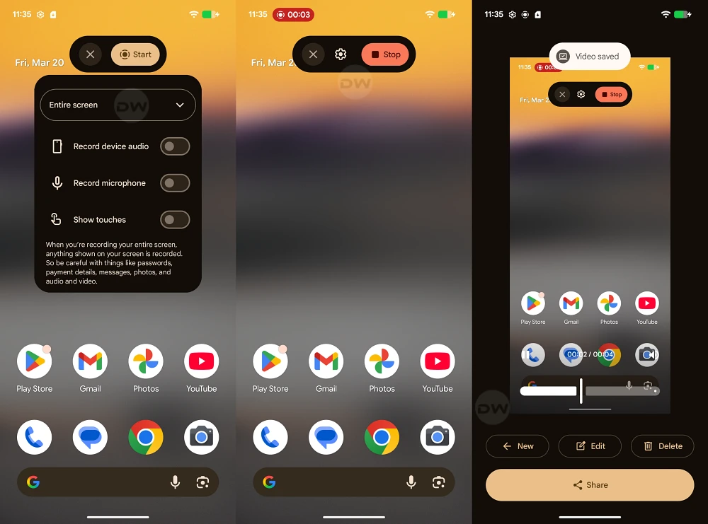
The utility of the system’s built-in tools has not been ignored, as evidenced by the comprehensive Screen Recording Menu redesign. Screen recording has become an essential feature for creators, developers, and educators, and the previous interface was often criticized for being somewhat clunky. The new design in Canary 2603 focuses on clarity and user intent. The controls for audio sourcing—choosing between device audio, microphone, or both—are now more prominent and easier to toggle. Furthermore, the UI provides clearer indicators for "single app" recording versus "full screen" recording, a privacy-centric feature that prevents accidental notifications from appearing in a recorded video. This redesign reflects a broader trend in Android development where system tools are being elevated to match the quality of premium third-party utilities.
Further evidence of Google’s attention to detail can be found in the revised Permission Dialog Box. These dialogs are the primary interface for the Android security model, appearing whenever an app requests access to the camera, location, or contacts. In Canary 2603, the width of these dialog boxes has been increased, and the internal UI has been restructured. The wider layout allows for more descriptive text, ensuring that users fully understand why an app is requesting a specific permission before they grant it. This change also improves the ergonomics of the "Allow" and "Deny" buttons, making them easier to reach and interact with on modern, taller smartphone displays. It is a subtle but impactful change that enhances the overall professional feel of the software while reinforcing the platform’s commitment to transparent security.
![Android Canary 2603: Here's Everything New [Screenshots/Video]](https://droidwin.com/wp-content/uploads/2026/03/app-bubbles-android-canary-2603.webp)
Underlying all these visible changes is a sophisticated technical foundation. The Canary 2603 build appears to be optimizing how the System UI handles resources, particularly when rendering the new blur effects and windowed bubbles. As mobile hardware continues to advance with more powerful GPUs and NPU-assisted processing, Google is leveraging that overhead to provide a more fluid and visually rich experience. The transition from the stark, flat designs of the early 2020s to this more textured and customizable interface indicates that Android is entering a mature phase of its lifecycle. It is no longer just about adding features, but about refining the "feel" of the OS to ensure it remains competitive with Apple’s iOS, which has long been praised for its fluid animations and consistent design language.
As these features move from the Canary branch toward more stable releases, they will likely undergo further polish. However, the core themes of Canary 2603—restored user control, native privacy enhancements, and a more layered visual identity—are clear. By bringing back separate connectivity toggles, Google is acknowledging that user efficiency should not be sacrificed for the sake of a minimalist aesthetic. By introducing native app locking and wider permission dialogs, they are strengthening the trust between the user and the device. And by expanding bubbles and adding blur effects, they are making the most of the modern hardware that defines the current flagship landscape.
![Android Canary 2603: Here's Everything New [Screenshots/Video]](https://droidwin.com/wp-content/uploads/2026/03/transparency-widgets-menu-android-canary-2603.webp)
In conclusion, Android Canary 2603 is more than just a routine update; it is a declaration of intent. It shows a Google that is responsive to its community, rigorous in its pursuit of security, and increasingly focused on the fine details of the user experience. While it remains to be seen which of these features will make the final cut for the public release of Android 17, the groundwork laid here suggests a future for Android that is more powerful, more private, and more beautiful than ever before. For the millions of users who rely on the platform daily, these changes promise a device that works more intuitively with their needs, rather than forcing them to adapt to a rigid and overly simplified interface.
